Heinz Ketchup wanted to increase sales and tried an idea to sell bottles with green ketchup, the factory had to work 24/7 to manage production. It was then the largest sales increase in the company’s history with 10 million bottles sold the first 7 months.
Rocket Fuel
Rocket Fuel conducted an analysis of 111 online campaigns in the telecom industry during 2013-2014. Ads with a green background colour was most successful, the buying decision was 1.4 times higher than other ads average value.
An animation in the ad increased the buying tendency with an average of 84 % compared to regular ads. I can see a parallel to movies with model images at a fashion site for example. Nelly.com has product images from different angles, and a short catwalk movie where you can see the product on a walking model.
In the ads that Rocket Fuel analysed, they concluded that the factors with the greatest success were animated ads, ads with both an offer and price details, ads where you could check availability and click to buy immediately, and green backgrounds.
Different Colours for Different Purposes
Colours affect our buying decisions, both conscious, and sub-conscious. The colour blue is said to evoke feelings as dependability, and trust. It is no coincidence that several financial institutes use blue. According to a study in Journal of Business Research, 15 % are more inclined to return to a store with blue colours than orange.
Green is supposed to be the colour that are the easiest for us to grasp. It is associated with wealth and eco friendliness.
Black is said to be powerful and sophisticated, and is often used to market exclusive products, and can also be used to present simpler products in order to make them appear more exclusive, for example in the fashion industry.
White is supposed to represent purity and simplicity, the major part of the leading skin-care products are packaged in white. It is also said to be honest and modern, perhaps why Apple has embraced it.
Purple is supposedly a colour that several women likes, and most men avoid. The question is how Telia thought when they started using purple as their company colour.
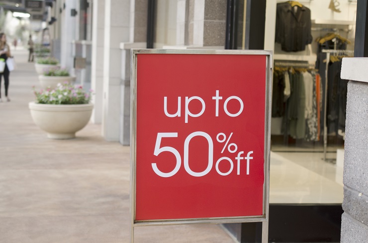
Why Sales Signs are Red
You have hardly missed a sales sign in a physical store or a web store, if it has red parts that is. According to Professor Andrew Elliot, people react faster and stronger when they see the red colour. The prime reason is said to be that it is programmed in humans as a warning for danger. Retailers often use this to catch customers’ attention when they want to show an offer that hopefully will lead to a purchase.
Try out Colour Combinations
What do you think when you question which colours that should be used? It is a whole science, and has also a lot to do with likes and opinions, both for seller and buyer. Get to know your target group, and which colours that suits them, try different ads, or why not an A/B test with different colour combinations at the site.