Updated design
UX/UI has been done through close collaboration with the customer. Since Textilhuset's products and images are often colorful, a more stylish design was chosen.
- A new blue primary color has been chosen, which is found in the logo and which reappears on buttons and other parts to attract attention or increase contrast.
- The layout has been broadened to suit Textilhuset's customers who like to shop on desktop and who add many items to their cart.
- A consistent sans-serif font has been chosen to suit the web and give a calm impression.

In the old design, there was some unused space next to the logo, which we have now used for both Search, Log in, My products and Shopping cart, and the logo has been simplified to take up less space. The important functions have also been given larger fonts and icons to show the hierarchy. Here, we have also highlighted the product categories in the menu so that you can more quickly click on what you are looking for or want to explore more. The home page has inspiring content with showcases and links where products can be tagged directly in the images.
Product page with different variation options
One goal of the product page was to make it easier for customers to shop and to improve the shopping experience with images and design changes.


In addition to the more traditional product page, we have also tailored several different variants of product pages adapted to different products and how customers buy them. Above is such an example with a fabric that is available in different colors and lengths.
We have made specifications and information about the product visible at the top of the product page instead of being hidden under a tab. This is something that Textilhuset's customers benefit greatly from as in many cases you need to know the specifications for a product. You can also click directly on the length you want to add to the shopping cart and do not have to first click on Choose length and then select the size in another window, as on the old page, which makes shopping faster. Especially if you buy a large number of sizes and colors, which their customers often do.
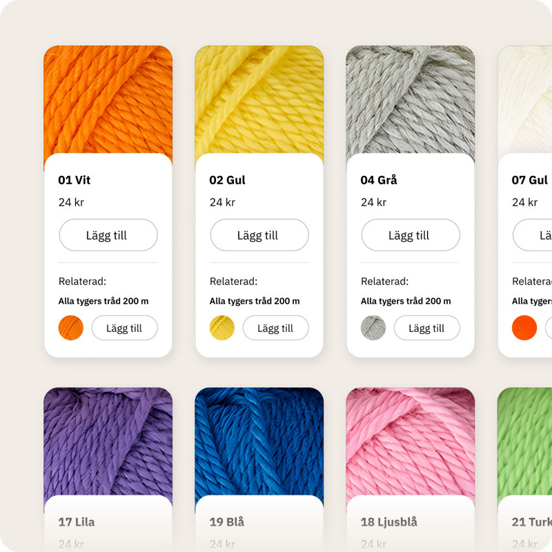
In this variant where we work with the different colors in so-called cards, we have the advantage that the product images are large and the customer can then get a better idea of the color and texture of the fabric unlike the old layout when there were small images in a list. You also have the opportunity to use the product card for a specific color of a fabric on other pages, for example on related products, category pages or on content pages.
Another product variant is a type of matrix/table where you get an overview of all the different sizes and variants of the product and can quickly add products to the shopping cart.

Working methods and tools
All designs are made in Figma, a modern design tool, where you not only see the design itself but also create interactive prototypes. You can then share the prototype with the client who can then see exactly what the website will look like and can click around the site in their browser. You can also add comments directly to the prototype, which can be pinned where you want them.

During the design work, we were constantly in close contact and coordination meetings with Magnus Bennegård, who is the E-commerce manager at Textilhuset. As Magnus has direct contact with many customers and an overall insight into the business, we were constantly able to get valuable feedback and information about customer behavior and wishes.
Clear, fast and user-friendly
Finally, we would like to mention some important things to consider during the design work.
User-friendly – We always have the end customer in mind when we design and often ask the question What is best for the user? We want it to be as smooth and simple as possible for the customer. This is achieved by carefully thinking through flows and the customer's journey. But it is also something that the visuals themselves support. By having a clear hierarchy in the design, you show the customer what is important and it becomes easier to understand the content. You can lead the customer's eye by using size, color and contrasts. Also, by being consistent in the design and using the same design language throughout the site, it becomes clearer for the customer to see what it can and should do.
Aesthetically appealing – It should also be nice of course, even if it is perceived in different ways. But a modern and appealing website gives a good impression and makes it easier to sell the products. We pay attention to detail and ensure that the design is harmonious and balanced. A certain style and color may not suit a certain type of product, but very well for another type of business.
Performance – Although we are going through the design in this case, it may be worth mentioning the performance of the site. By realizing the design with lightning-fast technology, the customer gets a lively and seamless shopping experience. There are thousands of products that are handled, displayed in search results and the like, which makes technology all the more crucial for everything to go as fast as you expect from a modern e-commerce. We will show more of the technical parts in the next part of the customer case about Textilhuset's new webshop.
The images in the case are from the design phase in Figma and illustrate how we worked out the solution. The final version of the website that is published may look different.

